Color perception changes significantly as we age, affecting far more than simple visual preference. Color-vision problems in the blue-yellow spectrum affect 45 percent of people in their mid-70s and rise to two-thirds by the time people reach their mid-90s. For seniors and their families, this represents a quality of life issue that extends well beyond aesthetics.
The aging process causes eye lenses to yellow and thicken, making colors appear more gray while subtle shade variations become difficult to distinguish. These changes can significantly impact your loved one’s daily living experience. Selecting the right colors in an environment can greatly influence comfort, happiness, and even cognition. Colors can stimulate, excite, calm, and generally influence the way we think. Elderly people who spend time in pale surroundings with little contrast may find themselves feeling depressed by the drabness of the colors they perceive. Color therapy for seniors can help regain control of the home environment, making it feel like your favorite season all year long.
Finding the right colors for elderly eyes requires understanding what doctors and design experts actually recommend. This guide explores the best paint colors for seniors, which colors are easiest for seniors to see and read, and how to use color effectively in different spaces to enhance well-being, safety, and enjoyment for your aging loved ones.
Red, Orange, and Yellow: Energizing Warm Colors
Warm colors create powerful physiological responses in seniors, making them valuable tools for specific environments and needs.
Red for boosting energy and appetite
Red stands out as the most emotionally intense color on the spectrum, producing measurable physical effects in older adults. Studies reveal that red stimulates a faster heartbeat and breathing rate, creating a natural energy boost. For seniors struggling with diminished appetite, this color offers a practical solution. Research indicates that red plates can increase food consumption in seniors with dementia by as much as 33%. This happens because red naturally causes the heart to beat faster, which simultaneously increases energy and appetite.
Red has additional therapeutic applications beyond mealtime benefits. Red-colored light therapy may improve circulation, strengthen the heart, and reduce inflammation. For seniors, muted versions like terracotta work better than intense reds, maintaining warmth without overwhelming the senses.
Orange as a social and stimulating accent
Orange creates an environment conducive to socializing and happiness. This warm, friendly hue works particularly well as an accent color rather than on entire walls, where it might become overpowering. Deeper orange shades promote calm, whereas brighter red-orange variations provide sudden energy boosts.
Orange has been associated with enthusiasm and creativity. Therapeutically, orange-tinted environments may stimulate the lungs and thyroid gland, potentially increasing oxygen levels. This makes it particularly valuable for seniors with respiratory concerns.
Soft yellow for morning happiness and alertness
Soft yellow evokes sunshine, creating cheerful spaces that naturally elevate mood. Its connection to the sun makes it particularly effective in morning spaces or rooms that lack natural light. Warm yellow and gold shades help seniors feel secure while raising alertness and inspiring creativity.
Moderation remains essential with yellow. Research indicates people lose their tempers more frequently in yellow rooms, making it unsuitable for seniors prone to agitation. Saturated yellow can build emotional energy quickly, making it better for brief exposure. For optimal results, stick with softer, muted yellows that brighten without overwhelming.
Blue, Green, and Lavender: Calming Cool Colors
Cool colors serve as vital therapeutic tools in senior living spaces, creating environments that promote relaxation and emotional well-being.
Blue for relaxation and stress relief
Blue, found abundantly in nature through skies and water, evokes feelings of calmness and tranquility. This serene color creates a sense of security and stability, making it ideal for seniors experiencing stress or anxiety. Research shows that blue can actually reduce heart rate, producing a natural “sleepy effect” and lowering body temperature.
For older adults, blue rooms offer practical benefits beyond just feeling pleasant. Studies indicate people are more productive and creative when working in blue environments. This makes blue an excellent choice for activity rooms or spaces where seniors engage in hobbies or creative pursuits.
Soft blue works especially well in bedrooms and bathrooms, resembling spa-like settings that naturally relax the body and mind. Blue is universally recognized as the most popular color, potentially due to its association with tranquility and creativity.
Green for balance and connection to nature
Green creates immediate connections to nature and promotes overall well-being. This balanced hue offers particular benefits for seniors as it’s the last color dementia patients lose the ability to see. Green clothing can improve communication with those experiencing cognitive decline.
The human eye can distinguish approximately 100 different shades of green, significantly more than other colors which register only a few dozen hues. This heightened sensitivity has evolutionary origins and explains why green environments feel so naturally calming.
Green spaces have been linked to improved sleep quality and reduced symptoms of anxiety and depression. Even exposure to green through artwork can lower blood pressure and heart rate. This makes green ideal for living rooms, reading nooks, or spaces designed for relaxation.
Lavender for sleep and emotional calm
Lavender stands out for its remarkable impact on sleep quality. Clinical studies show that seniors exposed to lavender increased their nightly sleep by 41 minutes compared to those using placebo oils. For elderly individuals struggling with insomnia, this natural solution offers significant relief without medication.
Lavender’s benefits extend to emotional regulation as well. Research indicates aromatherapy with lavender significantly improves anxiety (SMD = -0.83) and depression (SMD = -0.85) in older adults. Light purple tones work best in summer months, while deeper hues prove more effective during fall and winter.
Lavender should be avoided in offices or creative spaces as it stimulates the sleep-inducing parts of the brain. Instead, incorporate this soothing color in bedrooms or evening relaxation areas where its calming properties can be fully utilized.
Brown, White, and Black: Neutral Colors with Purpose
Neutral colors provide balance in senior living spaces, working alongside warm and cool hues while serving their own distinct functional purposes.
Brown for grounding and safety
Brown offers immediate security and comfort for seniors. This earthy tone creates stability, making it perfect for creating safe environments where older adults can feel secure. Brown transforms rooms into cozy sanctuaries, particularly effective in spaces where family gatherings occur.
The warm qualities of brown trigger pleasant associations with autumn leaves and hot chocolate, adding comfort to living spaces. For many seniors, these connections evoke positive memories while creating a grounded feeling. Consider brown rugs, throw pillows, and accent furniture in common areas to provide both visual warmth and psychological comfort.
White for space and clarity
White creates perceived spaciousness in senior living environments. This clean shade makes rooms appear larger, which benefits compact senior spaces. White walls reflect natural light effectively, enhancing brightness throughout the day.
White represents simplicity and clarity while reducing visual clutter. It helps seniors see better and breathe easier, contributing to overall comfort. However, designers caution against excessive white, as too much can create sterility and emptiness.
Black for focus and quiet
Black creates sophisticated environments for relaxation and focus, though it’s sometimes overlooked for seniors. This deep tone offers hidden comfort and quiet concentration, making it suitable for reading rooms during fall and winter months.
Black requires careful implementation since it can overstimulate seniors with dementia. Some specialists suggest black flooring before doorways or stairwells might improve safety, as Alzheimer’s patients perceive these areas as holes and avoid them.
How to Use Color in Everyday Senior Spaces
Finding the right colors for your loved one’s living space requires practical application strategies that address their specific needs and daily routines.
Best paint colors for seniors by room
Each room in a senior’s home serves different purposes and benefits from targeted color choices. Bedrooms work best with soft blues and greens that create calming environments for better sleep. Dining areas benefit from vibrant colors that stimulate appetite, with warm reds and oranges being particularly effective. Living spaces work well with organic, neutral palettes that provide comfort without overwhelming the senses. Bathrooms and hallways benefit from bright, light-reflecting colors that open up the space and improve visibility.
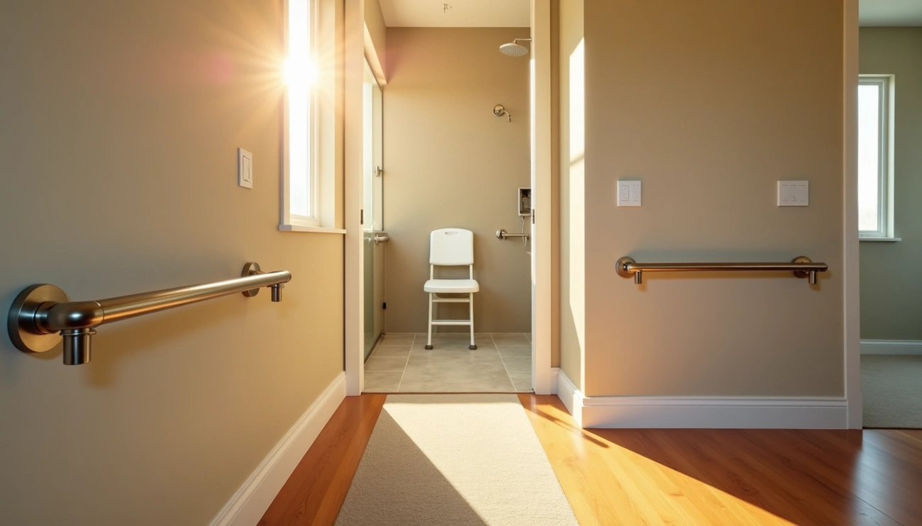
Using contrast to improve visibility
High contrast between walls and trim helps older adults distinguish boundaries and navigate safely. You might consider painting stair edges with contrasting colors or using high-contrast tape to differentiate steps. For dining, dark placemats under white dishes or white placemats under dark dishes make meals easier to see. A contrast ratio with minimum value of 7:1 for standard print text ensures readability for those with vision impairments.
Colors easy for seniors to read and navigate
Solid, bright colors like red, orange and yellow reflect light better, making them easiest for elderly eyes to see. Light-colored objects against darker backgrounds provide heightened contrast, as do darker items against lighter backgrounds. Certain color combinations should be avoided for seniors:
- Navy blue, brown and black
- Purple, blue and green
- Yellow, pink and light green
Avoiding glare with matte finishes
Glossy surfaces reflect light harshly, creating confusing glare that’s particularly problematic for aging eyes. Choose matte or low-sheen finishes on walls, floors and furniture. Select flat paint instead of high-gloss enamel, and consider replacing highly reflective surfaces with softer ones, such as carpet instead of tile. These changes minimize reflection while maintaining durability and cleanability.
Tips for seasonal color adjustments
Seasonal color changes can significantly impact seniors’ moods and comfort. For winter months, incorporate warm reds in breakfast nooks to combat morning sluggishness. During summer, soft blues create cooling effects. Green works year-round, connecting residents to nature regardless of season. Purple stimulates creativity but should be avoided in bedrooms where calm is preferred. Make color adjustments based on natural light changes throughout the year.
Bottom Line
Color choices significantly impact seniors’ daily experiences, affecting everything from safety to emotional well-being. Understanding how aging changes color perception helps you create environments that support your loved one’s independence and comfort.
Warm colors serve specific purposes in senior spaces. Red stimulates appetite, orange encourages social interaction, and soft yellow creates cheerful environments without overwhelming the senses. Cool colors offer different benefits, with blue promoting relaxation, green connecting to nature, and lavender improving sleep quality. Neutral colors provide balance, with brown creating security, white enhancing spaciousness, and black offering sophistication when used appropriately.
High contrast remains the most important factor for senior-friendly spaces. Contrasting colors between walls and trim, stair edges, and dining items help aging eyes distinguish boundaries and navigate safely. Matte finishes prevent confusing glare that can disorient seniors.
Room-specific color choices make the biggest difference. Bedrooms benefit from calming blues and lavenders, dining areas work best with appetite-stimulating reds and oranges, and living spaces need balanced, natural palettes that provide comfort without overwhelming.
Color selection becomes a practical tool for enhancing seniors’ safety and quality of life. Making thoughtful choices based on expert recommendations and individual preferences creates environments where aging adults can thrive comfortably and independently.
Key Takeaways
Understanding how aging affects color perception and implementing strategic color choices can dramatically improve seniors’ safety, comfort, and overall quality of life in their living spaces.
• Warm colors boost energy and appetite – Red increases food consumption by 33% in seniors with dementia, while soft yellow creates cheerful morning spaces that enhance alertness.
• Cool colors promote healing and calm – Blue reduces heart rate and stress, green connects to nature and aids sleep quality, and lavender increases nightly sleep by 41 minutes.
• High contrast is essential for safety – Use contrasting colors between walls and trim, stair edges, and dining items to help aging eyes distinguish boundaries and navigate safely.
• Matte finishes prevent dangerous glare – Choose flat paint over glossy surfaces to minimize harsh light reflection that can confuse and disorient seniors.
• Room-specific colors serve different purposes – Bedrooms need calming blues/greens, dining areas benefit from appetite-stimulating reds/oranges, and living spaces work best with balanced neutral palettes.
The key is matching colors to both the room’s function and the individual senior’s needs, creating environments that support independence while enhancing daily comfort and well-being.
FAQs
Q1. What colors are most beneficial for seniors’ living spaces? Blue, green, and soft yellow are highly recommended for seniors. Blue promotes relaxation and reduces stress, green connects with nature and aids sleep, while soft yellow creates cheerful, energizing spaces without being overwhelming.
Q2. How can color choices improve safety for older adults? Using high contrast colors is crucial for senior safety. Painting stair edges or using contrasting tape on steps can help with navigation. In dining areas, using dark placemats with light-colored dishes (or vice versa) improves visibility during meals.
Q3. Are there colors that can help stimulate appetite in seniors? Yes, warm colors like red and orange have been shown to stimulate appetite. In fact, studies indicate that using red plates can increase food consumption by up to 33% in seniors with dementia.
Q4. What type of paint finish is best for senior-friendly spaces? Matte or low-sheen finishes are ideal for senior spaces. These finishes help avoid glare, which can be confusing and problematic for aging eyes. Opt for flat paint instead of high-gloss enamel on walls and surfaces.
Q5. How can seasonal color adjustments benefit seniors? Seasonal color changes can significantly impact seniors’ moods. For example, incorporating warm reds in breakfast areas during winter can combat morning sluggishness, while soft blues create a cooling effect in summer. Green works well year-round, maintaining a connection to nature regardless of the season.